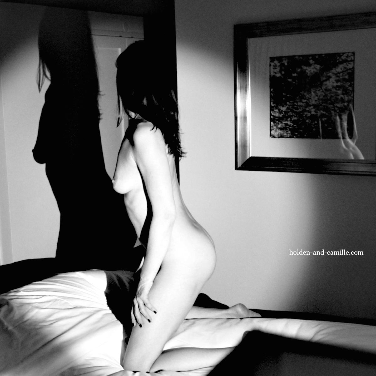
While there is a lot to like about the “first choice” image we posted last fall, we were happy to grab an alternate version from the archives and try something a little different with the idea. The contrast in this one is more stark and dramatic, and my pose is a bit more…booty-ful. But by far our most unforgivable mistake with the initial post was cropping the photo and eliminating my reflection in the glass of the framed picture. I mean, we cut out the Dimples of Venus! ~C

The reflection in the glass is my favorite part!
Mine, too! We were really kicking ourselves for leaving it out of the first post. 🙂 ~C
I absolutely love the contrasts in this one. It’s so beautifully artistic! That is one to print and hang on the wall.
xo Aiden
Thank you, darling! It reminded us of those Old Hollywood glamour photos, after the contrast tweak. We should have done the first photo in black and white, also. ~C
The Three Graces more like! I love this! I may need to keep it for something 😉 x
Ooooo, we’d love to see what you could do with this photo as an inspiration! 🙂
Patience! 😉 x
http://fridayerotica.blogspot.co.uk/2016/08/i-never-know-which-of-your-three-selves.html With respect x
This is the most perfect combination of your words and our photo yet, we are sure of it! Very, very well done! ~C
Oh thank you! I am so glad it pleased you 🙂 x
Very much so! 🙂