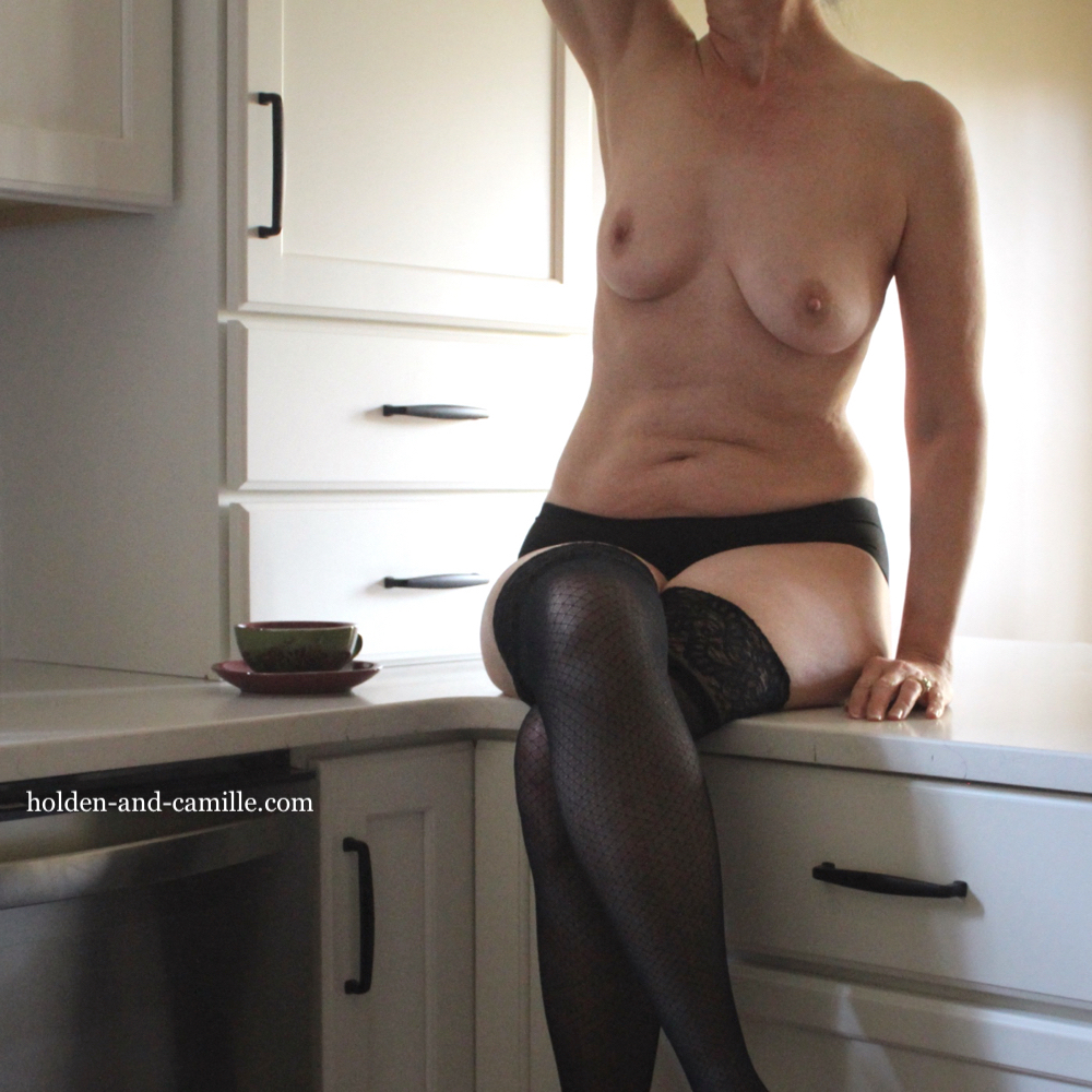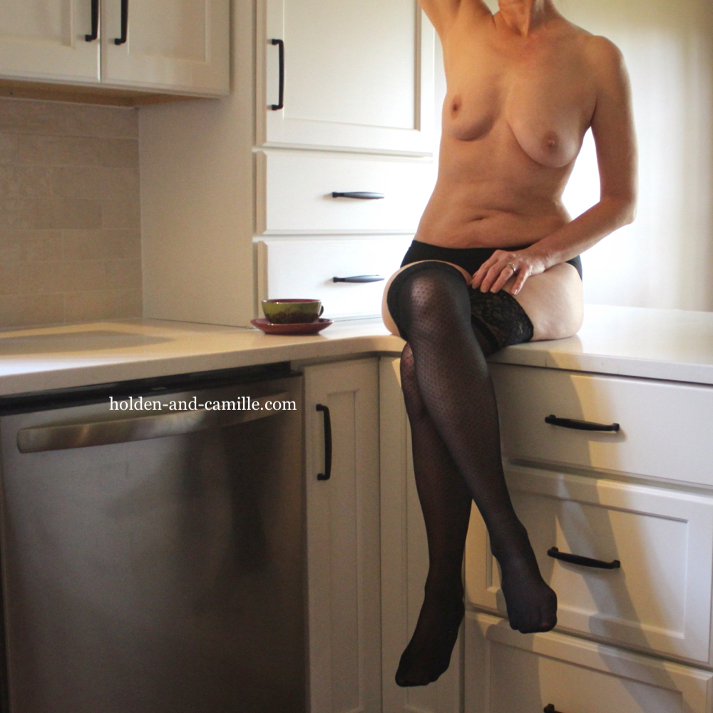

Happy weekend, y’all! We are facing a bit of a challenge in illustrating the immense impact of the renovation projects, simply because we had studiously avoided shooting in the less attractive areas of the house. This is especially so for the master bathroom, but it applies to the kitchen, as well. However, we did find a couple of previous posts to remind you of the ugliness that has been replaced: see here and here. Gone are the decaying faux butcher block laminate countertops, along with the sad gloomy-brown cabinets, which have given way to sparkling quartz and crisp white modernity.
This week’s top photo, the close-up, was shot with no lights on, which is why it looks a little different from the bottom shot, where we turned on one light to better highlight the tile backsplash. We’ll have a total of three posts from the kitchen and three from the bathroom, along with a few other shots for the sake of variety, from last weekend’s efficient and delightful session. Take care! ~C

That looks fooking great!!
Thank you! Sometimes we walk in there and just look at it, with different combinations of lights on. 🙂 ~C
lovely model
Thanks so much! 🙂 ~C
Wow.
You look great.
The new kitchen remodel is super!
Much appreciated! 🙂 A couple of coats of paint, and then we’ll call it good! ~C