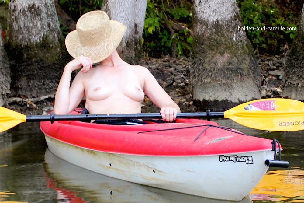
This month’s Sinful Sunday prompt, “Reshoot,” was published at the most opportune time. We had already scheduled a couple of days off work, during which we had planned a trip to the family lake house for some private photography adventures. And heaven knows there are more than a few old lake house photos that we had considered revisiting!
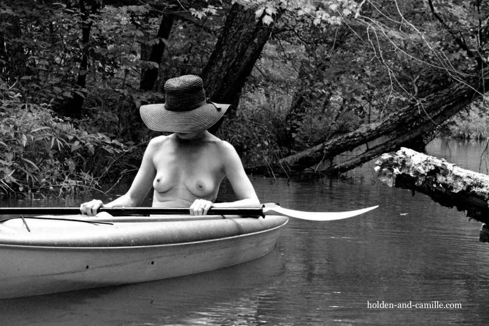
Our aesthetic, such as it is, has evolved a lot over the past five years. We used to post exclusively in black-and-white, even when we had the rare opportunity to shoot outdoors. And we have both learned a thing or two about posing, as well. So, please, compare the photo above to the one below, which was taken on July 19, 2013 and published a few days later. And below the photo, you’ll find those magical lips to help you visit with all of the contributors who are taking advantage of a do-over this week!


I love them both.
Thanks! The older photo was one of the first outdoor shots I ever had taken, so I was really nervous! Things have changed a lot in three years. 😉 ~C
Hmmm… we’re on the river quite a bit but unfortunately we have never seen this lovely view.
Thank you…Though something tells me that Hunter has seen views at least equally as enticing on your river trips! 😉 ~C
The magical lips are also inside that kayak.
😉 ~C
I prefer the bright primary colours of the first one. Although both have their err, attractions. 😉
Thanks! Holden thought so, too, though I hate the slumped-over pose in the original one. ~C
I actually really love both of them. The bright colours of the new one feel fresh and outdoorsy, but I love the depth and mystery of the black and white one. Xx
Thank you, lovely! It was a pleasure to go back and revisit some older shots to see what we could make of them with time and experience added… 🙂 ~C
In total agreement with Exposing 40 . . . beautiful fun and bouncy colours in the first, and erotic intrigue and mystery in the second.
Both so lovely and . . . as always . . . so sensual!!!
Xxx – K
Very kind of you, dear! We actually couldn’t help ourselves and re-made two others, also. So now we have posts for this evening and tomorrow, as well, on the same theme. Hope you’ll check those out, too!
I really love both of them, as even though the image seems the same, both seem to have different stories to tell. Like Exposing 40 said, there’s a different feel to the two images. Both are lovely!
Rebel xox
Thank you, Rebel! It’s amazing how the edit sets the mood — Both were shot with playful intentions, but the edit on the old one is so gloomy and betrays its caption. ~C
I love both of them but they are both very different. The black and white has a aged quality to it and reminds me of stills from an old movie whereas the colour version feels much more vibrant and playful
Mollyxxx
It was a very inspiring prompt, Molly! And it came at a perfect time, too. We are constantly revisiting concepts from past attempts, and so we took to this idea right away. 🙂 ~C
this is so terribly sophisticated, as i have come to expect from you both!
That’s so kind of you, thank you! We do our best. 😉 ~C
Ever the awkward squad, I prefer the original—there is a dreamy, moody air about it, more stories to be found within it 😉 x
We are happy to hear contrasting opinions, so long as they are delivered cordially! 😉 Thank you!
I love both of them, the colours of the first but the sheer seductiveness of the second
Thank you very much! Hope you enjoy looking at the next two, as well, while we revisit a couple of others from three years ago at the lake house… 😉 ~C
Oh – I love how those bright kayak colors pop against the trees! I like how they’re reflected in the water, too. I’d love to come ashore to find a sexy lady like you snoozing under a hat on a summer afternoon!
Wouldn’t that we wonderful, Jo? Thanks so much for your kind words! ~C
I love both of them! Black and white and colour, and the evolution of cute hats! As model and photographer you’re both a credit to your local river. Great photos!
How lovely of you to say! Thank you! This was a much prettier location for shooting than the stagnant creek in the older shot, though it was a bit less private… 😉
I love them both for different reasons. The colour one has confidence whereas there is something so alluring about the shy, coy pose in the B&W one.
Thank you very much! Though I certainly have never been accused of being coy! Not me! 😉 ~C
Both photos are beautiful as are both breast. However the B/W adds that touch of erotica. 🙂
Glad you liked them both! The photos, that is… 😉 ~C
These are fantastic! I love your approach to photography, you always tell a story in your images. As many people have said, I like both photos for different reasons, the color is almost like an advertisement for a resort (a certain type of resort, of course). The second is, as Molly mentioned, like a still from an old movie. Really fantastic!
How very kind of you, Maria! Thank you! We’d be happy to see the color photo on a nudist resort pamphlet. 😉 It was a pleasure to go back and take another stab at the idea. ~C